Talent is cheap, you pave to be possessed or obsessed, rather. You really have to feel like you cannot do art, and that is something you can't will." - John Baldessari
His Life
|
John Baldessari is a leading Californian artist. Painting was important to his early work. When he emerged, in the early 1960s, he was working in a gestural style. By the end of the decade, he had begun to introduce text and already existing images, often to create riddles that highlighted some of the unspoken assumptions of contemporary painting. And in the 1970s he abandoned painting altogether and cremated all of his pictures which he keeps in a gold urn (in the shape of a book). He then made in a diverse range of media, though his interests generally centered on the photographic image.
|
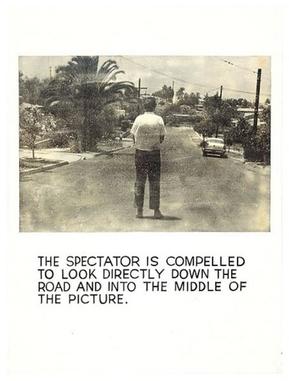
Wrong (Composition)
|
In 1967 John Baldessari displayed his ‘wrong’ series. He uses a variety of photographic images anchored by text. The most popular of which titled ‘wrong’ shows an image with poor composition juxtaposed by the text ‘wrong’ below the photograph. The irony of the word is what makes the image so appealing, just clear judgment of the photo. The message that Baldessari was trying to state in the image is why should we conform to conventional aspects of art or photograph, why does our work have to be judged?
|
|
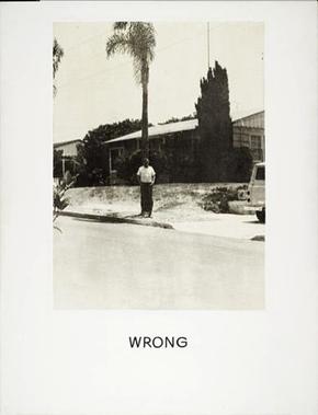
I loved the idea that somebody would just say that this is right and this is wrong. So I decided I would have . . . a work of art that was wrong- which seemed right to me." - John Baldessari
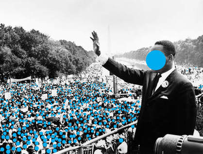
Dots (Appropriation)
|
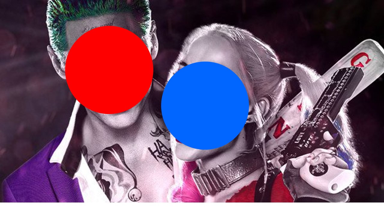
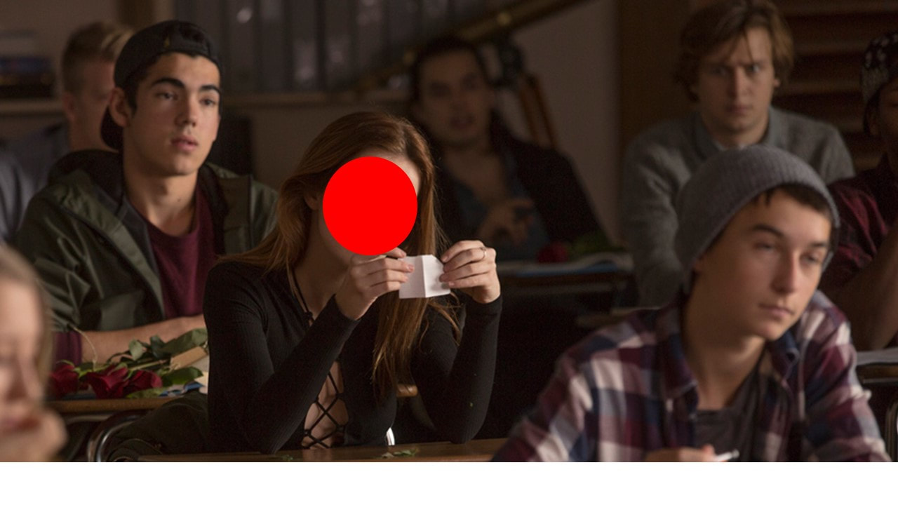
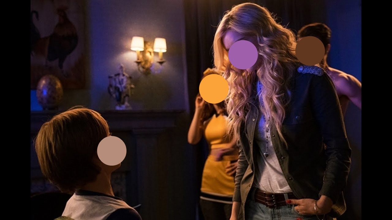
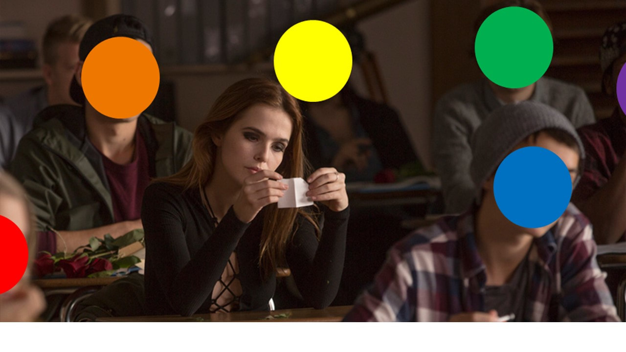
The coloured dots pasted on the photographs are actually price stickers. Over the years, Baldessari had been collecting black-and-white news images of people at multiple civic events. He said "I just got so tired of looking at these faces" so he covered their faces with coloured stickers, "If you can't see their face, you're going to look at how they're dressed, their stance, their surroundings." He believes by doing so, he manages to erase individuality and forces the viewer to look elsewhere in the photo. His coloured dots also are a key to different emotions or ideas; red is dangerous/angry, green is safe, blue is platonic, and yellow is crazy.
|
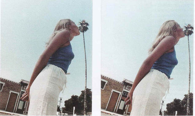
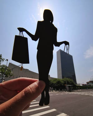
Forced (Angles) Perception
Forced perspective is a technique which uses optical illusion to make an object appear farther away, closer, larger or smaller than it actually is. It manipulates human visual perception through the use of sized objects and the relationship between them and the vantage point of the onlooker or camera.
|
|
My Own Examples
In these pictures below I have explored how Baldessari uses dots and applied it to my own work. It makes you focus on the thing you wouldn't always focus on, however in the picture on the bottom right I used to coloured dots to make the audience focus on what they normally would and nothing else.
|
|
